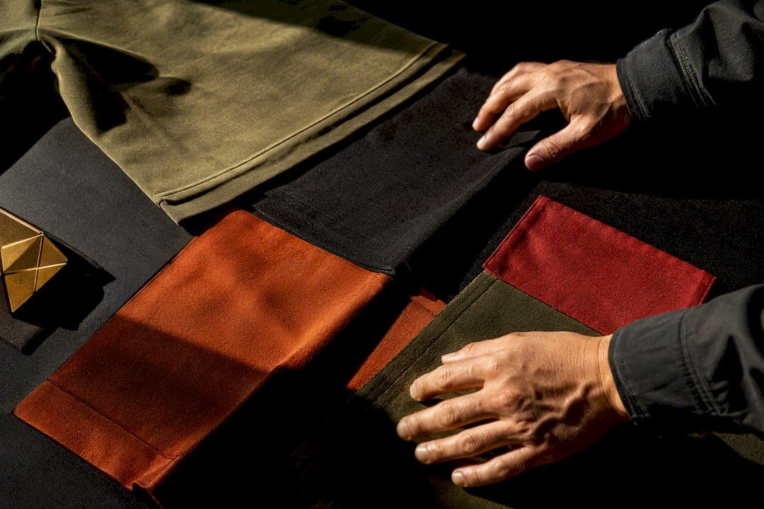
The fastest way to nail streetwear color matching is simple: pick a neutral base, add one accent color, and stop there. If you want an easier lane, go tonal, stack shades of a single color, and let texture do the heavy lifting. Both paths lean on one framework: the 60-30-10 rule.
TL;DR:
- Sticking to one bold accent color with neutral tones, or stacking shades within one color family, ensures balanced streetwear outfits.
- Using the 60-30-10 rule helps maintain proper proportion, with 80% neutral and 20% deliberate color for quick, intentional styling.
- Matching sneakers first allows for better outfit harmony, especially when choosing statement shoes to set the overall tone.
- Avoid over-matching or using too many saturated colors, which creates visual noise and diminishes the outfit's impact.
- Texture and fabric choices significantly influence color perception, making varied materials essential for depth and layered style.
Table of Contents
- What Are the Basic Rules of Streetwear Color Matching?
- Ready-to-Copy Streetwear Color Combinations
- How Do You Match Sneakers and Accessories to an Outfit?
- How to Build a Monochrome or Tonal Streetwear Look
- What Color-Matching Mistakes Should You Avoid?
- Why Trust This Streetwear Color Advice?
- Do Seasons and Trends Change How You Match Colors?
- Does Color Psychology Affect Streetwear Style Choices?
- How Do Fabric Textures Affect Color Matching?
- How Do You Balance Bold Colors With Neutral Basics?
- Should Skin Tone Affect Your Color Choices?
- What Actually Matters in Streetwear Color Matching
- Shop the Palettes: Where to Find These Colors Ready-Made
- Sources
- FAQ
What Are the Basic Rules of Streetwear Color Matching?
Every fit you've ever admired comes down to one of three relationships. Complementary pairing puts opposite colors together (think red and green, or blue and orange) for high-energy contrast that reads loud on purpose. Analogous pairing uses colors that sit next to each other on the wheel, like olive, mustard, and rust, for a look that feels pulled together without effort. Monochrome stays inside one color family and leans on texture and shade to create depth instead of contrast. These three moves form the backbone of most color theory for streetwear, and picking the right one starts with knowing what mood you're going for.
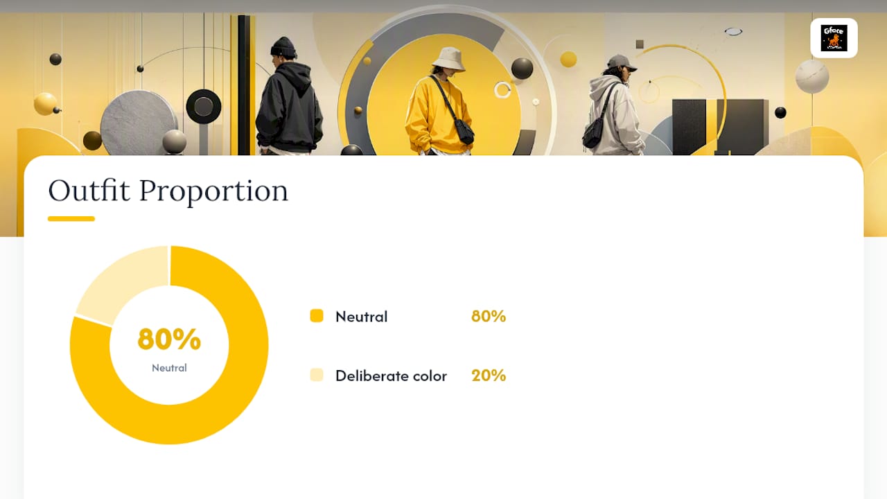
Undertones matter more than most people give them credit for. Warm undertones (gold, peach, olive skin) tend to pop next to rust, cream, and warm neutrals like tan or camel. Cool undertones (pink, blue, or neutral skin) usually read better in true black, icy grays, and jewel tones. The cheat code: hold the garment up near your face in daylight, not under store lighting. If it brightens your face, it works. If it flattens you out, skip it.
Proportion decides whether an outfit reads as styled or accidental. The classic proportion rule breaks your fit into a dominant base, a secondary color, and a small accent. Streetwear brands lean on this because it builds visual hierarchy without needing many colors to do it.
- Complementary: high contrast, high energy, harder to pull off daily
- Analogous: relaxed harmony, safest for layering multiple pieces
- Monochrome: near-foolproof, relies on texture instead of contrast
- 80-20 shorthand: 80% neutral, 20% deliberate color for a quicker gut check
Pro Tip: If you're staring at your closet with no time to think, default to 80-20. Eighty percent neutral, twenty percent color, done.
Ready-to-Copy Streetwear Color Combinations
You don't need to invent your own palette every morning. Steal one of these.
Monochrome stacks work because they mix values and materials, not because every piece matches exactly:
- All black, mixed textures. Matte cotton tee, a leather or vegan-leather jacket, and canvas pants. The contrast comes from fabric, not color.
- Cream-to-tan gradient. Off-white tee, tan hoodie, light brown pants. Each piece sits a shade apart, so the whole fit reads intentional.
- Olive and earth-tone stack. Olive cargo pants, a rust or brown graphic tee, and a tan jacket. Earth tones mix easily and flatter a wide range of skin tones, which makes this stack close to foolproof.
Neutral base plus one accent color is the other reliable lane:
- Black jeans, white tee, and a single pair of red sneakers as the only loud note in the fit
- Navy hoodie, khaki pants, and one graphic tee with a green print peeking through
- Grey sweatsuit with a cobalt blue sneaker as the sole accent
The echo technique ties both approaches together: pull one color from a graphic tee or sneaker and repeat it exactly once somewhere else, like a hat or a bag strap. Repeat it twice and it starts looking planned in a try-hard way. Choose contrast when you want the fit to announce itself, and harmony when you want it to feel effortless.
How Do You Match Sneakers and Accessories to an Outfit?
Sneakers usually decide the whole outfit's direction before anything else does, which is why some stylists suggest building the fit around the shoe first, then working up through pants, top, and accessories.
Two rules cover most situations. If your sneakers are loud (a bold colorway, a flashy collab pair), keep everything else neutral so the shoes stay the focal point. If your sneakers are neutral (white, black, grey), you've got room to go louder on the top or outerwear.
- Statement shoes: pair with black, white, grey, or tan basics only
- Neutral shoes: use them as a launchpad for a bolder hoodie or jacket
- Echo one shoe color exactly once elsewhere, in a cap or a bag, never in three places at once
- Rank accessories by how much color they can carry: hats and bags handle bold color well, jewelry and small logos barely register
Accessory sizing matters as much as color choice. A single colored cap reads as a deliberate detail. A colored cap, a colored bag, and a colored watch together reads as noise, even if all three colors technically match.
Pro Tip: If you're not sure whether your outfit needs an accent, put the shoes on first. If the fit already feels complete, skip the extra accessory.
How to Build a Monochrome or Tonal Streetwear Look
A single-color outfit only looks flat when every piece is the exact same shade. Mix light and dark values within that color family, plus a couple of different materials, and the same palette suddenly has depth. A dark wash denim paired with a lighter grey tee, for instance, keeps the tonal feel while avoiding a flat, uniform look.
The layering order matters. Put your most neutral piece on the outside (a grey or black jacket) and let color intensify as you move inward, toward the tee or the hoodie underneath. That way the loudest part of the fit peeks out instead of overwhelming the whole silhouette.
- Swap a plain cotton hoodie for a ribbed or fleece one in the same color to add texture without adding color
- Layer a lighter grey tee under a charcoal jacket instead of matching both pieces exactly
- Add one textured piece (corduroy, waffle knit, canvas) to break up an otherwise flat monochrome stack
Pro Tip: Two identical black cotton pieces worn together looks like a uniform. One cotton and one fleece or leather piece, same color, looks styled.
What Color-Matching Mistakes Should You Avoid?
Visual noise is the number one killer of an otherwise good outfit. Wearing four or five saturated colors at once competes for attention and cancels out whatever statement you were trying to make. The fix is to keep one bold color per outfit and let neutrals carry the rest.
Undertone mismatches sneak up in bad lighting. A color that looked fine under fluorescent store lights can wash you out in daylight, so always check outdoors before committing.
Over-matching is the quieter mistake. Matching your hat, shirt, and sneakers to the exact same shade reads flat, not styled. Echo a color once. Don't repeat it across every piece.
- Too many saturated colors: cut to one bold accent, buffer the rest with neutrals
- Undertone clash: recheck the color in daylight, not indoor lighting
- Over-matching: echo a color once instead of repeating it across the whole fit
| Mistake | Quick Fix |
|---|---|
| Visual noise from multiple bold colors | Drop to one accent color, rest stays neutral |
| Undertone mismatch | Check the piece in daylight before wearing it |
| Over-matching every item | Repeat a color once, not throughout the outfit |
Why Trust This Streetwear Color Advice?
This guide comes from Victor, streetwear content author for Gfacegear, who breaks down real outfit formulas for a Brooklyn-born brand built on bold, wearable color choices. The rules here aren't theory pulled from a textbook. They're the same logic behind Gfacegear's limited-edition drops and lookbook pieces, where a single accent color (a lion-graphic sneaker, a Greek Key accessory) often carries an entire fit.
- See the formulas applied in 9 Couples Streetwear Outfits to Copy: Match Without Matching
- Check current palette direction in Streetwear Trends 2026: What's Dominating US Streets
- Study monochrome execution in Five All-Black Streetwear Formulas You Can Copy Today
Do Seasons and Trends Change How You Match Colors?
Seasonal shifts change your palette more than your rules. Summer favors lighter values, pastel accents, and breathable fabrics that show off tonal dressing without the bulk of layering. Winter pulls toward deeper, richer shades, earth tones, and heavier textures where a single color can carry across a jacket, hoodie, and pants without feeling flat, since heavier fabric already adds visual weight on its own.
Trend cycles move faster than color theory ever will. A specific colorway (a particular green, a specific shade of orange) can dominate one season and fade the next, but the underlying structure, complementary, analogous, monochrome, doesn't expire. That's the real advantage of learning the framework instead of chasing whatever color is trending: you can drop a trendy accent into a 60-30-10 fit and swap it out next season without relearning anything.
Check seasonal palette examples in Summer Streetwear Outfits: 6 Ready-to-Copy Looks if you want to see how lighter values and swim-ready pieces fit the same rules used for heavier winter fits. The formula stays constant. Only the weight and saturation shift.
Does Color Psychology Affect Streetwear Style Choices?
Color carries mood whether you plan for it or not. Black reads as confident and controlled. Red signals energy and demands attention, which is why it works best as a 10% accent rather than a dominant base. Earth tones like olive and rust read as grounded and easygoing. Cool blues and greys tend to read calm, almost understated, even in a bold silhouette.
This matters for streetwear specifically because the category is built around self-expression. Choosing a fit isn't just about what matches. It's about what mood you're putting into the world that day. A head-to-toe black fit with sharp tailoring says something different than an olive and tan stack with relaxed cargo pants, even if both follow the same proportion rules.
Use that psychology deliberately. If you want to stand out in a room, lean into one saturated accent color against a neutral base. If you want a look that feels approachable and low-key, stay analogous or tonal. Neither choice is more correct. They're just different signals, and knowing which one you're sending is part of actually dressing on purpose instead of by accident.
How Do Fabric Textures Affect Color Matching?
Two garments in the exact same shade of black can look like completely different colors depending on the material. Matte cotton absorbs light and reads darker. Leather and nylon reflect light and read lighter, almost silvery, even in the same dye lot. That's why an all-black outfit built entirely from one fabric can look flat, while the same colors across cotton, fleece, and leather look layered and deliberate.
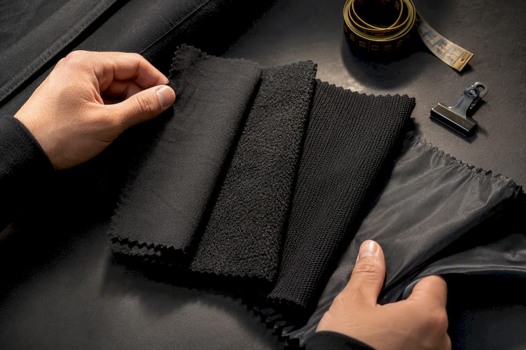
Texture also changes how bold colors feel. A saturated red in a smooth, glossy fabric reads sharp and modern. The same red in a heavier, textured knit reads warmer and more casual. This is part of why upgrading fabric quality and focusing on one standout piece with neutral basics does more for a fit than adding another color ever could.
Mixing textures is especially useful in monochrome and tonal builds, where color contrast is off the table by design. A ribbed hoodie under a canvas jacket over waffle-knit pants, all in shades of grey, creates visible depth without a single hue change. If your monochrome fits feel flat, the fix usually isn't a new color. It's a new fabric.
How Do You Balance Bold Colors With Neutral Basics?
Every outfit needs an anchor, and that anchor should almost always be a neutral. Black, white, grey, tan, and navy do the quiet work of holding a fit together while one bold piece, a red sneaker, a printed hoodie, a bright accessory, gets to do the talking.
The mistake most people make is treating bold colors as a starting point instead of an accent. Start there and you end up chasing a second and third color to balance the first, which is exactly how outfits end up loud instead of intentional. Start with your neutral base instead, then ask what single color needs to show up to make the fit feel finished.
This is where the 60-30-10 split earns its keep again. Sixty percent neutral base, thirty percent secondary neutral or muted tone, ten percent bold accent. That ratio holds whether the bold piece is a swimwear print, a graphic tee, or a colorway on a sneaker. The neutral majority is what lets the accent register as a choice instead of a coincidence.
Should Skin Tone Affect Your Color Choices?
Skin tone doesn't limit what you can wear, but it does change which shade of a color works best. Someone with warm undertones tends to look better in warm reds (brick, rust-red) rather than cool-toned reds (cherry, cranberry). The reverse holds for cool undertones, where jewel tones and true blues tend to read cleaner than earthy, muted shades.
The daylight test still applies here. Hold a piece up near your face in natural light before buying it, since a color that brightens your face in daylight is usually a color that works, regardless of what the trend cycle says about it. Store lighting lies. Your bathroom mirror at noon doesn't.
Personal coloring also affects how much contrast you can wear comfortably. Deeper skin tones tend to carry saturated, high-contrast combinations, like a complementary red and green pairing, without it overwhelming the face. Lighter or more neutral skin tones sometimes read better with one muted tone paired against a brighter accent, so the color does the work without competing with the face for attention. Neither is a rule you have to follow exactly. It's a starting point for figuring out what actually looks good on you, not just what looks good on a mannequin.
What Actually Matters in Streetwear Color Matching
Most color-matching advice out there overcomplicates a decision that should take you thirty seconds. The conventional wisdom pushes people toward elaborate wheels and rigid rules, when in practice, the entire system boils down to two moves: neutral plus one accent, or tonal plus texture. Everything else is a variation on those two ideas.
What's overrated is chasing exact color matches. Nobody's outfit looks better because their cap is the identical hex code as their sneakers. What's underrated is the echo technique, repeating one color note once, because it does more visual work with less effort than any other trick in this guide.
If you take one thing from this, prioritize proportion before you worry about which colors go together. Get your 60-30-10 split right, and almost any color combination reads as intentional. Get the proportion wrong, and even a technically correct color pairing looks off. That's the gap between advice that sounds smart and advice that actually changes how your outfits look.
— Victor
Shop the Palettes: Where to Find These Colors Ready-Made
Some streetwear brands build their identity around one bold statement piece against a clean, neutral foundation, matching the formulas in this guide.
Start with the hoodies, which cover the neutral base half of nearly every formula in this guide, from all-black stacks to earth-tone tonal builds. Then browse the full shop for the sneakers, hats, and limited-edition swimwear pieces built to carry your one accent color, whether that's a lion-graphic sneaker colorway or a bold print from the Limited Boriqua Swimwear drop. If you want first access to those limited pieces before they sell out, The Pride Membership runs $9.99 a month and gets you early access and sitewide perks. Grab your neutral base, pick your accent, and let the fit speak for itself.
Sources
- Color Theory for Streetwear: Stop Wearing Colors That Clash — WEAR2AM Blog | WEAR2AM
- Men's wear: grown-up streetwear — FashionBeans
FAQ
What Is the 3-3-3 Rule for Clothes?
The 3-3-3 rule generally refers to building outfits from a small rotating set: 3 tops, 3 bottoms, and 3 pairs of shoes that all mix and match. It's a closet-minimalism concept rather than a strict color rule, but it pairs naturally with a neutral-plus-accent palette since neutral basics mix more easily across combinations.
What Is the 3-Color Rule in Clothing?
The 3-color rule suggests limiting most outfits to three colors total, often two neutrals plus one accent, to avoid visual noise. It works as a simpler cousin to the 60-30-10 proportion rule covered earlier in this guide.
What Are 5 Colors That Look Good Together?
Black, white, grey, olive, and rust form a flexible five-color rotation, since the neutrals (black, white, grey) can anchor almost any outfit while olive and rust work as either accents or a tonal earth-tone stack on their own.
What's Gen Z's Favorite Color for Streetwear?
There's no single confirmed favorite color across Gen Z streetwear shoppers, and trend colors shift by season anyway. What stays constant is the format: a neutral base carrying one bold, trend-driven accent color, which is why Gfacegear's limited drops rotate accent colorways while keeping core neutral pieces like hoodies and tees consistent.
How Do I Start Matching Sneakers to My Outfit?
Pick your sneakers first, then build the rest of the outfit around them. If the sneakers are a bold colorway, keep your clothing neutral; if they're neutral, you have room for a louder top or jacket.